Home Page Resource Links Sounding Board Books

CHAPTER ONE: THE LOGIC OF
STATISTICAL PROCESS CONTROL (SPC) CHARTS

TABLE OF CONTENTS

Chapter One Chapter Two Chapter Three Chapter Four References and
Photocopying Rights

from
How to Recognize When Special Causes Exist,
A Guide to Statistical Process Control

© Ends of the Earth Learning Group 1998

by
Linda Turner and Ron Turner

Assume you own a business selling medical equipment.

Jane, your star salesperson, only sold $99,000 worth of goods this month even though her long term average is $102,000 per month.

Should you ask Jane, "What's different? How come your sales dropped this month?"

Probably you will say to yourself, "Well, it's not that much different. She probably just had a bad month for no particular reason."

What if sales dropped to $95,000 or $90,000?

When should you say something?

A "special cause" means that "something was different."

Statistical Process Control (SPC) charts have one essential purpose. They answer the question, "When should we start looking for special causes? When should we start asking, 'What was different?'"

85% to 90% of errors and downturns in performance have no special cause.

10% to 15% of errors and downturns do have special causes that may need repairing. SPC helps you identify when to look for a special cause.

"Normal" variation means nothing was different even though the results varied.

You decide to study your paperwork system at work. You discover that in a normal week, your five person office makes about forty-nine (49) errors in paperwork that requires rework. These errors include omissions, transpositions of numbers (45 becomes 54), and just plain memory lapses.

"I don't know why I wrote down the wrong decade! Do you think I should see a doctor?"

A special cause of memory lapse would be Alzheimer's Disease

It's "normal" to once-in-a-while forget things.

All memory systems will "goof" periodically for no apparent reason!

Once you understand systems, you will accept the fact that no system is perfect. All systems will produce a certain number of errors regardless of how much people "try harder." Better systems will have better averages, but they never become perfect.

If you can "find" the root cause of all errors, then something is wrong and you are fooling yourself. Unless you have a perfect system that has no inherent variation, that means that you will never be able to absolutely rule out "bad luck" when you are attempting to identify special causes.

When we say,"Blame it on the system," that doesn't mean, "Give up!" But it does mean there is no point in looking for someone or some thing to blame.

When we blame results on the system, it means we need to redesign the system.

When we blame results on a special cause, it means we look to see what needs fixing.

Your first question when approaching "problems" should be, "Is something special going on?"

This week, the office error rate spiked up to 65!

Should you sit everyone down and say, "We've got to figure out what went wrong! Something must be different. Our average is only 49 and we just hit 65!"

If you can't say anything at 65 errors, then how about 80 or 90? How do you know when the system is broken and in need of attention?

SPC charts will identify the magic point at which you should start looking for something special going on.

If you don't know where this point is, then you will easily stumble and start "fixing" things that aren't broken.

Just think of how your staff will respond when you tell them "You people need re-training," or "I want you all to try harder," when the error spike was really normal random fluctuation.

Start by finding your average results.

You back-track and find data for the last year relative to your office paperwork.

You divide the total errors for the year by 52 weeks and have concluded that your long term average error rate is 49 per week.

Very few weeks were average, though. Most of the time, the errors were above or below the average. Sometimes there were extremely different results. Last year there were weeks with more than seventy errors.

SPC starts by finding the average results.

This average is called the "Central Tendency" of the system.

Your paperwork system has a central tendency of 49 errors per week.

Next determine how much variation should be expected if there are no special causes.

Knowing your average error rate is 49 isn't enough information. We also need to know how often you did the job correctly. Assume we studied your past history and discovered that while your average error rate was 49, your average success rate was 803 times a week. That means you were processing 852 (which is 49 + 803) pieces of paperwork per week and goofing less than 6% of the time. The number "852" is called "the size of your subgroup."

The subgroup size tells you how often you had a chance to do things right.

We can use this data to come up with a measure of expected variation for your system called "sigma"

SIGMA is not a medical problem. It is the mathematical symbol for a concept called standard deviation.

Your sigma is 6.8 errors per week which we found based on your average of 49 and subgroup size of 852.

Sigma measures the variation inherent in your system. When you have less inherent variation, then sigma becomes smaller.

Most people use a computer to calculate sigma because it is time consuming and cumbersome to do it by hand even with a calculator.

Let the computer be your math expert!

Is a sigma of 6.8 errors per week bad or good?"

Plus three sigma = 69----------------------

Plus two sigma = 63-----------------------

Plus one sigma = 56-----------------------

Central Tendency = 49--------------------------

Minus one sigma = 42----------------------

Minus two sigma = 35----------------------

Minus three sigma = 29--------------------

For about 17 weeks of the year (1/3 of the time), your error rate will be more than one sigma away from 49. For two to three weeks of the year (1/23 of the time), your error rate will be more than two sigma away from 49. Think how tempted you would be to search for something to blame when errors spike to 65 even though we should expect that to happen every year simply due to bad luck.

A sigma of 6.8 is neither bad nor good, but as you improve how your system functions, that sigma will start to drop. That will mean you will have started becoming more consistent over time.

More importantly, it will make it easier for you to recognize when there is a special cause that demands attention.

Normal variation is described in terms of sigma and central tendency. Statisticians have worked out the probabilities that results will be at one, two, or three sigmas from the mean.

There are eight critical rules of SPC used to interpret results as you gather them from week to week (or hour to hour, etc.) These rules do not come from statistical theory.

They come from economic trade-offs. You are better off looking for special causes only after rejecting the possibility that results were due to normal system variation. If you mistakenly pursue a special cause when in reality the results were due to random luck, then you will damage your system and cause overall performance to decline!

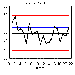
Upper Control Line = 69-------

Upper Warning Line = 63-----

Upper One-Sigma Line = 56---

Central Tendency = 49--

Lower One-Sigma Line = 42---

Lower Warning Line = 35-----

Lower Control Line = 29------

Apply the rules to our data. Did an error spike of 65 indicate something special was occurring? [Hint: Look at Rule #1 in the right hand column, and then look for the Upper Control Line above.]

Do you see how to change sigma into control lines and warning lines? [Hint: compare this page to the previous page.]

EIGHT RULES FOR IDENTIFYING SPECIALNESS

1. Any values outside the control lines. Freak value

2. Two out of three points in a row in the region beyond a single warning line. Freak value

3. Six points in a row steadily increasing or decreasing. Process shift

4. Nine points in a row on just one side of the central tendency. Process shift

5. Four out of five points in a row in the region beyond a single one-sigma line.Process shift

6. Fourteen points in a row which alternate directions. Shift work or overcorrection

7. Fifteen points in a row within the region bounded by plus or minus one sigma. Garbage data or overcorrection

8. Eight points in a row all outside the region bounded by plus or minus one sigma. Garbage data or overcorrection

The black horizontal center line is the average number of errors per week, 49.

The blue lines are One-Sigma Lines at 42 and 56. One-third of the time errors will fall outside the two One-Sigma Lines even though nothing special is occurring.

The green lines are two-sigma Warning Lines at 35 and 63. About one in twenty-times, the errors will be above or below the Warning Lines even though the system has remained stable.

The red lines are three sigma Control Lines at 29 and 69. One in four-hundred times, results will fall outside the Control Lines even though nothing special is in need of fixing.

Each week, you should record the weekly error rate in your SPC chart. You will instantly know whether the results warrant searching for a special cause. More importantly, you will instantly know if the results are telling you to BE MORE PATIENT and gather more data before acting.

What do I do when the errors spike to 65 and you tell me nothing special is going on?

If the 65 errors were normal system variation, then next week, the system will tend back towards its normal 49 errors per week

You can work on improving the system, but don't bother looking for an easy "fix." That could backfire on you.

If you again get 65 errors, then Rule #2 will tell you that something special is happening and you best take a close look for something that has gone "out of whack".

When nothing "special" needs fixing, then redesign the system so that anyone working in it will make fewer errors.

There are fourteen principles for improving systems described in our book,

How to blame the system and NOT mean "I give up!"
Principles For Improving Systems

KEY PRINCIPLES

  • Standardize how people do the same job.
  • Empower people to break the rules so that no one is strangled with red tape.
  • Reduce the number of steps and the number of people in a process.
  • Reduce interruptions.
  • Speed up feedback on errors.
  • Reduce memorization.
  • REDESIGN the system so people are less prone to making mistakes.

When looking for a "special" cause of problems, become a detective and use the sleuthing skills of any good "Who done it?"

What do special causes look like?

We've all been trained through schooling and life to deal with special causes. Look for differences in when things occurred, what occurred, how things occurred, where events happened, and who was working. When something breaks, there is frequently a special cause.

Special causes require special fixes. Sometimes, they fix themselves if the problem was simply someone was out sick.

You are better off erring on the side of blaming the system than erring on the side of blaming a special cause.

What's so bad about falsely blaming a special cause when an error spike was simply normal variation?

Imagine "fixing" an employee you thought was the special cause when in reality the error spike was simply normal variation.

If an error spike was simply due to bad luck, then results would improve even if you didn't do anything. When you falsely blame a special cause, you will mistakenly believe that your actions caused the improvement. Not only would you have fixed someone who wasn't at fault, but you would have mislearned what needed to be done the next time errors spike.

Other "fixes" might be changes in equipment, training, or staffing levels. No matter what the "fix", you will fool yourself into thinking you made things better without realizing the improvement was simply 
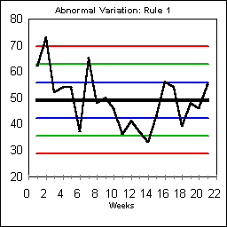
part of normal variation.

ABNORMAL VARIATION: RULE #1

Rule #1 is the simplest of all rules. Any data points outside the control lines are considered "special." These points are sometimes called "freak values" indicating something special happened, but then returned to normal.

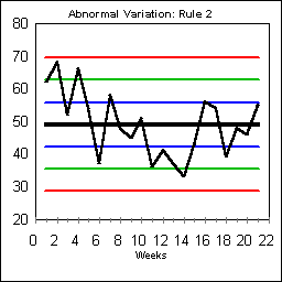
ABNORMAL VARIATION: RULE #2

Rule #2 is an early detector of "specialness". It looks for two out of three points in a row in the region beyond a single warning line. This run begins on Day 2. Usually Rule #2 like Rule #1 also indicates some freak "special" values, but it also might indicate a process shift that is permanent.

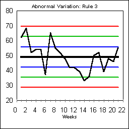
ABNORMAL VARIATION: RULE #3

Rule #3 recognizes trends by looking for six points steadily increasing or decreasing.

On this chart, the downward trend begins on day 7 and continues through day 14. Days 11 and 12 had the same value of 42. Simply skip days that are exactly the same in your count. This trend had statistical significance as of day 13. Rule #3 usually indicates a process shift rather some temporary "special" values.

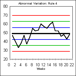
ABNORMAL VARIATION: RULE #4

Rule #4 recognizes trends by looking for nine points in a row on just one side of the central tendency.

On this chart, beginning on day 8, the data points start a lengthy run above the central tendency. Skip any days that land exactly on the Central Tendency. Rule #4 like Rule #3 usually indicates a basic process shift.

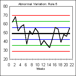
ABNORMAL VARIATION: RULE #5

Rule 5 looks for four out of five points in a row in the region beyond a single one-sigma line. This rule recognizes that it is abnormal for too many data points to be outside the normal plus and minus one-sigma range around the central tendency. This Rule is triggered by the data beginning on Day 11. Typically a process shift will trigger Rule 5.

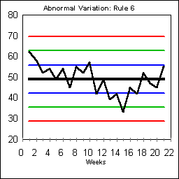
ABNORMAL VARIATION: RULE #6

Rule #6 looks for fourteen points in a row which alternate directions. This kind of flipping back and forth is usually an indication of shift work, alternating schedules of some sort, or overcorrection that is causing results to bounce from one over-corrected direction to another.

On this chart, the alternating pattern begins on Day #2, but doesn't become statistically significant until Day #15.

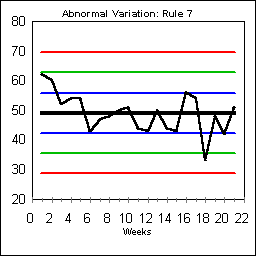
ABNORMAL VARIATION: RULE #7

Rule 7 looks for fifteen points in a row within the region bounded by plus or minus one sigma. The rule is based on the recognition that normal variation includes some results that will be fairly far away from the central tendency.

Sometimes Rule 7 indicates garbage-data which has been "corrected" to make people look better. From a worker perspective if people in the past had been falsely blamed for bad results, then it would be natural to protect themselves from bosses who truly don't understand variation. Rule 7 should not be used as an excuse to attack the workers who gathering data. Instead, it should be recognized as a system in which fear may be too prevalent.

ABNORMAL VARIATION: RULE #8

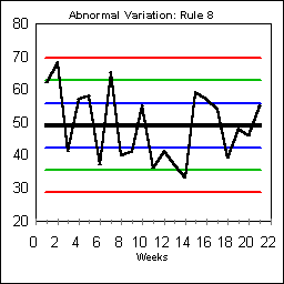
Rule 8 looks for eight points in a row all outside the region bounded by plus or minus one sigma. Rule 8 is triggered by the run beginning on Day 4. Usually this rule indicates garbage data or serious overcorrection from subgroup to subgroup if the data points are bouncing between extremes.

All Statistical Process Control (SPC) charts are used to help identify when something special is going on. Depending on the kind of data used, different SPC charts are chosen


How do I track something like percent of phone calls answered within three rings?


How do I track something like total sales by my sales agents?


How do I track the amount of time it takes to complete a task?

There are three basic groups of SPC charts that will cover most situations.

1. Proportion Charts: Chapter 2

  • % paperwork that has at least one error
  • % lab cultures that read false negatives
  • % airplanes requiring a major repair within a month
  • % of questions a student missed on a test
  • % of a physician's schedule that went unfilled
  • % of games won or lost
  • % absent from work
  • % of new hires who won't make it one year
  • % of work that will have to be redone or rejected
  • % of phone calls that operators answer with courtesy and respect
  • % of orders returned by customers
  • % of employees who said "I hate it here"
  • % of employees who said, "This place is the best place I ever worked"
  • % of the time vendors shipped the wrong product
  • % of times at bat that a baseball player will get a hit

2. Unit Charts: Chapter 3

  • Number of errors IRS agents make talking to 100 taxpayers over the phone
  • Number of deficiencies in 100 airplanes brought in for maintenance
  • Number of times interrupted in an hour
  • Number of complaints received per month
  • Number of completed sales contracts in a month
  • Number of errors in a day's work

3. Averages and Range Charts: Chapter 4

  • length of time a clinician takes to see a patient,
  • length of time to complete a task,
  • length of time it takes a customer to enter a store and leave,
  • length of time it takes a customer to call back with a complaint,
  • average weight of a grocery bag,
  • average height of a customer (perhaps in an airplane or other cramped space),
  • average temperature of freezers, etc.
  • Continuous data that can have a fraction

You are now ready to move on to the nitty gritty details of how to construct each of the above SPC charts.


TABLE OF CONTENTS

Chapter One Chapter Two Chapter Three Chapter Four References and
Photocopying Rights


Top of page Home Page Resource Links Sounding Board Books